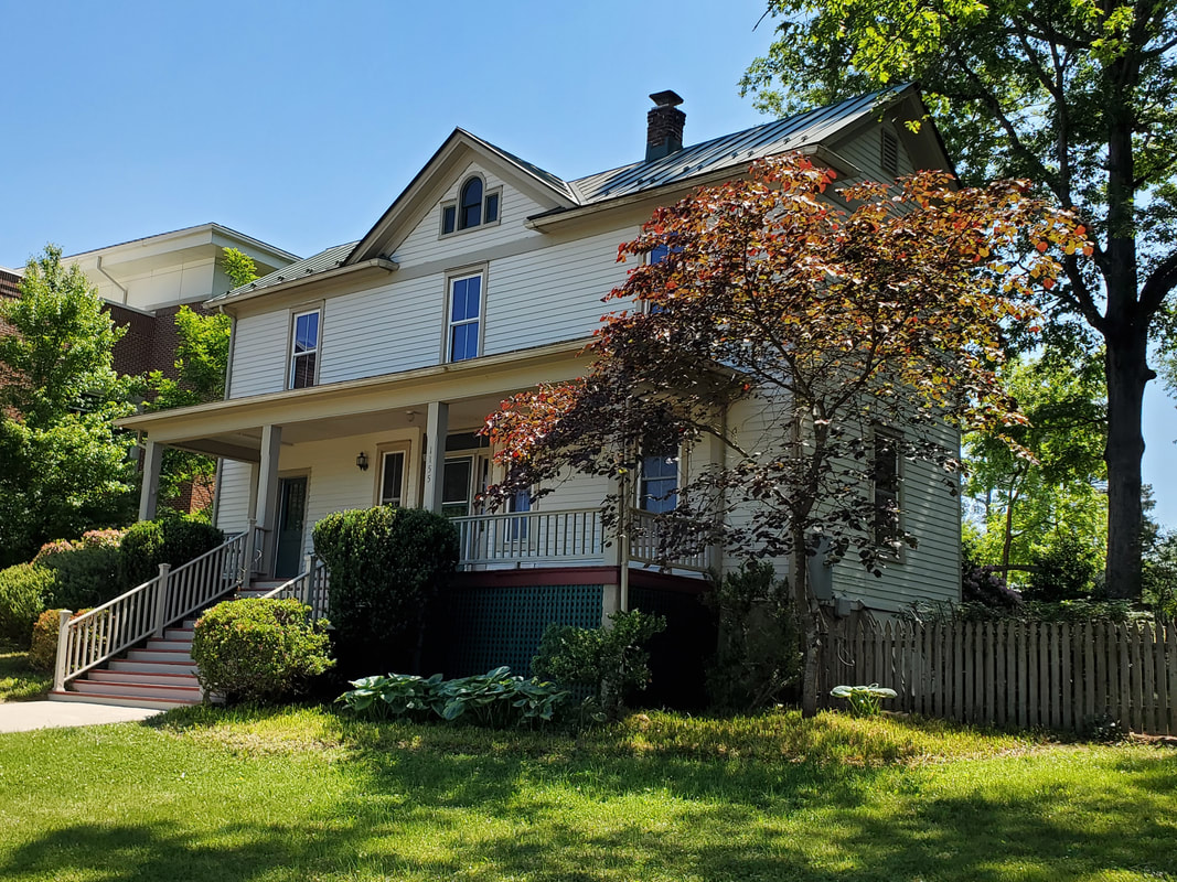
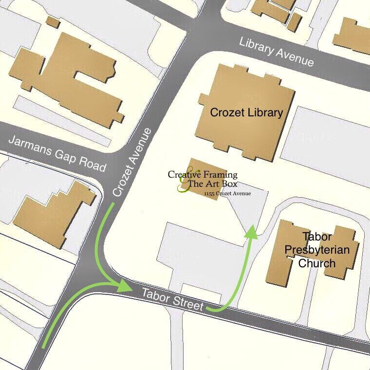
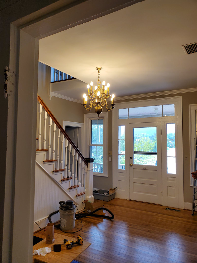
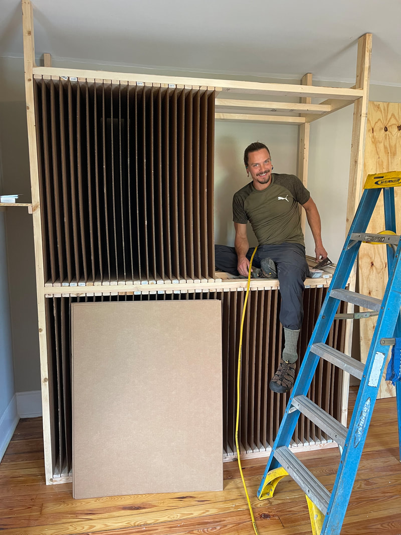
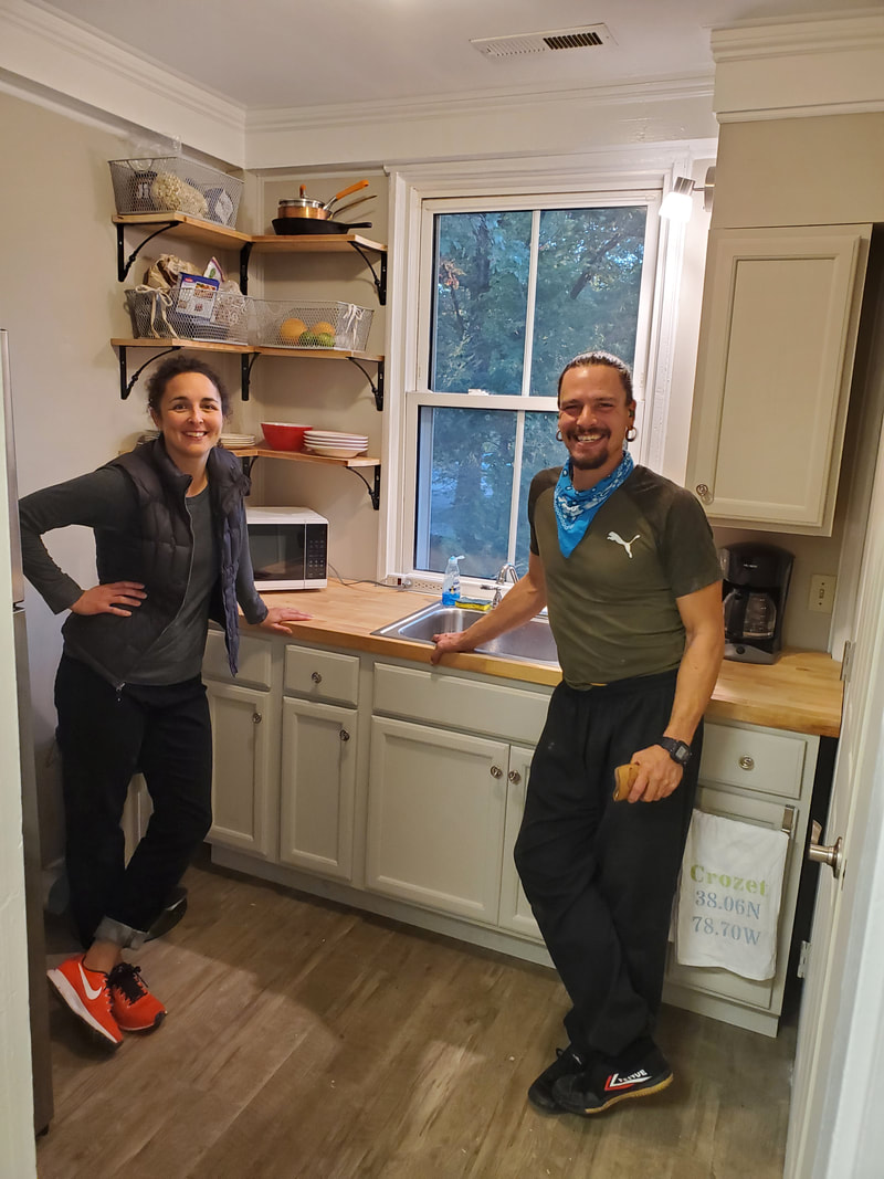
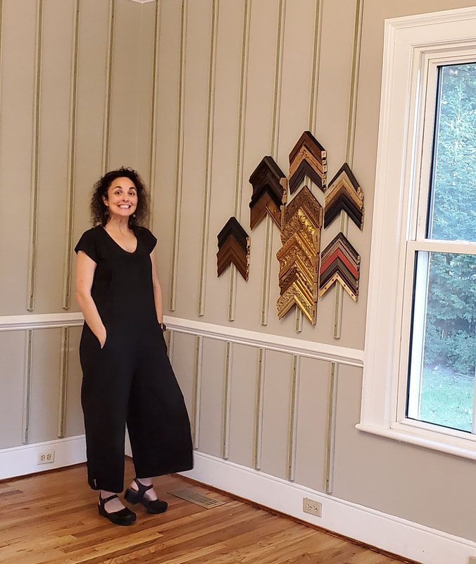
“Home is the nicest word there is.”Laura Ingalls Wilder 1155 Crozet Avenue It has been our dream for many years to own our own building and we’ve finally found it in the heart of Crozet, where our heart resides as well. We have purchased a property in downtown Crozet, and as our friend Martin Quarles said, we are nestled “between Knowledge and Salvation." Look for us between the Crozet Library and Tabor Presbyterian Church. This beautiful Colonial Revival home is located where Jarmans Gap Road meets Crozet Avenue. Built in 1905, the house has been used primarily as a residence during its long life, and it suits us beautifully. The main level will house our art supply sales and frame design areas. The upstairs provides plenty of room for our workshop, and our employees will finally have a lunchroom. We’re planning to host community events such as Paint Outs, classes and workshops. Wait till you see our beautiful side yard and the view from the front porch! Surprisingly, there’s more parking here than in our Three Notch’d location. To access it, turn onto Tabor Street from Crozet Avenue. Immediately turn left into Tabor Presbyterian Church’s gravel lot. Please drive gently through, to find our adjoining parking area. You’ll enter through the french doors at the back. We hope to be open in our new location by the end of November. For a sneak preview, come by our Three Notch’d location and grab Amanda - she’ll give you a personal tour. We look forward to a long and happy relationship with Crozet. We love being in the heart of the downtown area. We are finally home.
1 Comment
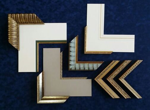
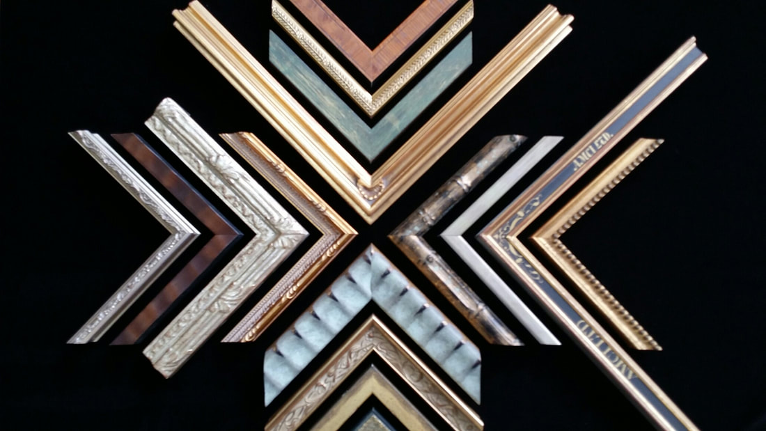 What is Bespoke picture framing? Bespoke is an old English word, first used in 1583, that describes a conversation between a client and an artisan. That conversation leads to a hand made product that is the desired item for the client. It represents a melding of the minds of the client and the artisan to produce a magical, one of a kind product that reflects the skill of the artisan and the vision of the client. 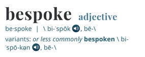 Image courtesy Merriam Webster Image courtesy Merriam Webster Most often the word is used to describe a custom made suit, that flatters the figure and design sense of a distinguished discerning buyer. In this century, bespoke has come to be used for hand made products that are made to the specifications requested by a patron. Bespoke is a very good description of the process involved in creating this special treatment of the artwork. The desires of the client, combined with the vision and suggested procedures of the artisan framer, create a unique presentation never seen in another home or workspace. Custom picture framing has always been a bespoke process. The client brings a treasure that they want to preserve and enhance. But it needs to fit in their life in a particular way. The mats need to complement the artwork. The frame needs to safeguard the artwork while complementing the design sense of the client and their home or workspace. 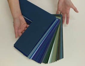 Just as with choosing the details of a custom shirt when you can choose your cuff style, your collar design, the pleats and tucks, as well as the fabric, bespoke picture framing allows almost endless choices to make the design completely yours. Hundreds of mat colors and styles from reverse bevels, 8 ply thickness, gold fillets and painted panels are only a few of the custom treatments. Combine that with thousands of frame possibilities and you begin to see the wide array of solutions there are to any design. Bespoke is the opposite of being limited to what is available in the big box store across town. It is one of life's little pleasures to have a Bespoke picture frame...Like having a custom made suit. Spoil yourself a bit. You won't be sorry.
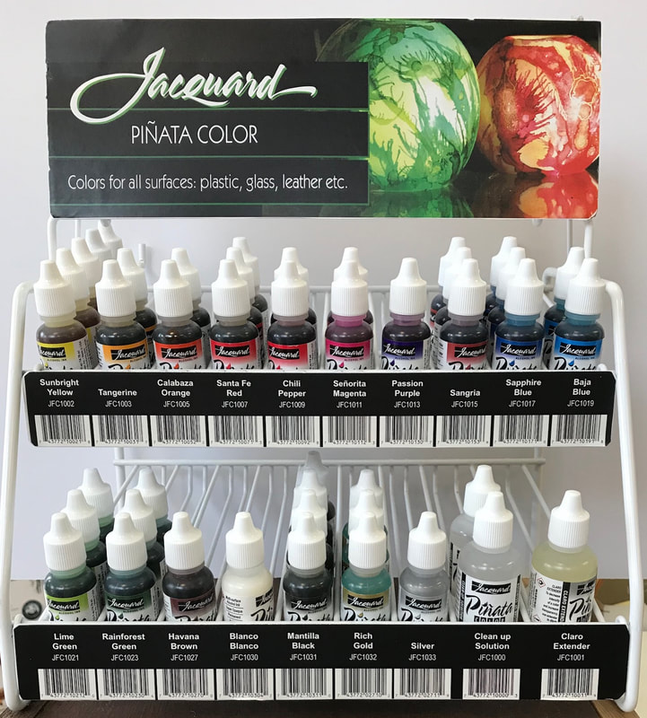
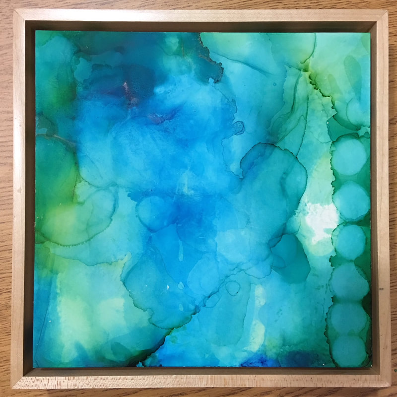
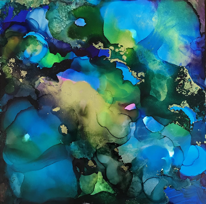
We have carried Jacquard Inks for a while but some our staff hadn't used them. Amanda and Jill got a chance to experiment with them at a recent trade show. They used the Jacquard Alcohol Inks on Ampersand Claybord panels. It was so much fun! These inks can be used on glass, plastic and leather. Some of our watercolorists use these inks on Yupo. With 17 vivid colors to choose from including gold and silver, you can make magic. The process was very simple. The ink comes in dropper bottles so you can put as much or as little ink on your surface as you would like. Tilt the surface to move the colors around or add some rubbing alcohol (from the drug store) to get more ink movement and to clean up your brushes. If you don't like what you did, use some rubbing alcohol to remove the ink! So easy, so much fun! This is what Amanda made! Beautiful colors flowing into each other with wonderful layers of transparency. This is Jill's experiment with alcohol inks. They both love the rich blue colors but this piece has some gold added for extra sparkle.
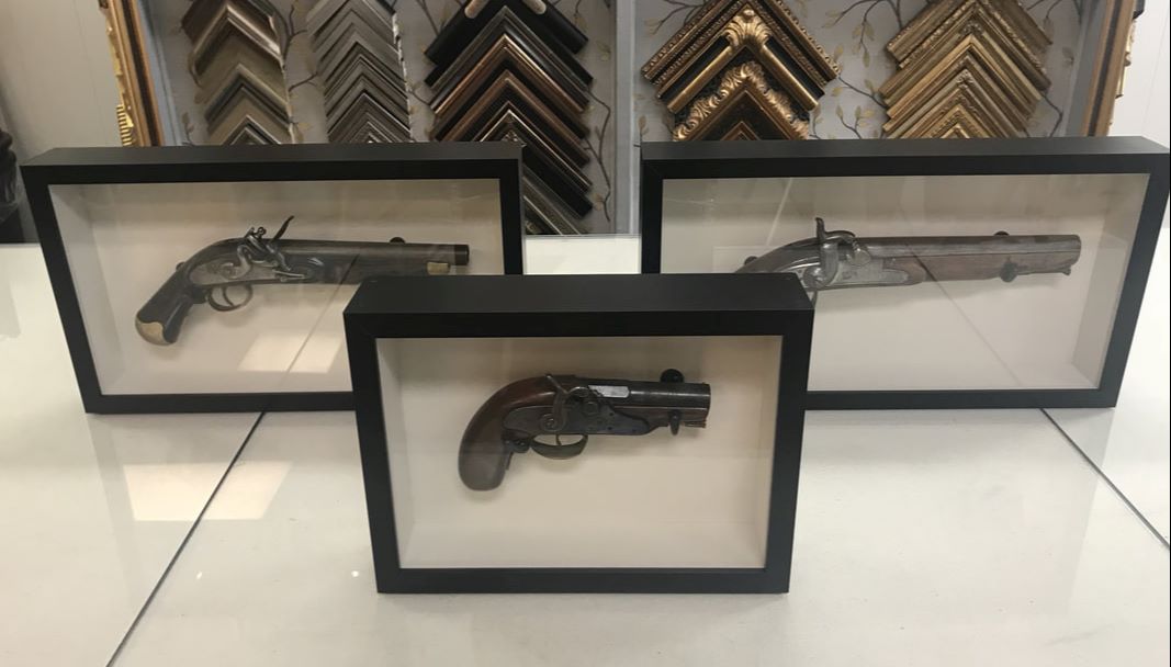
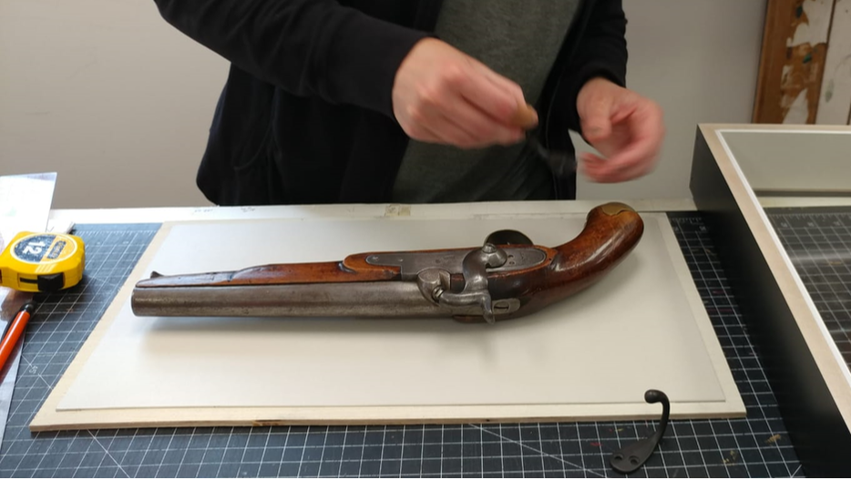
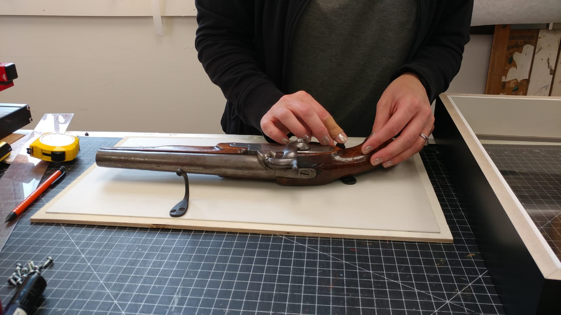
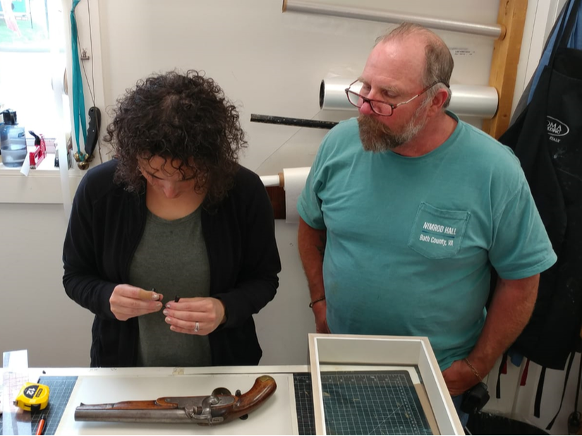
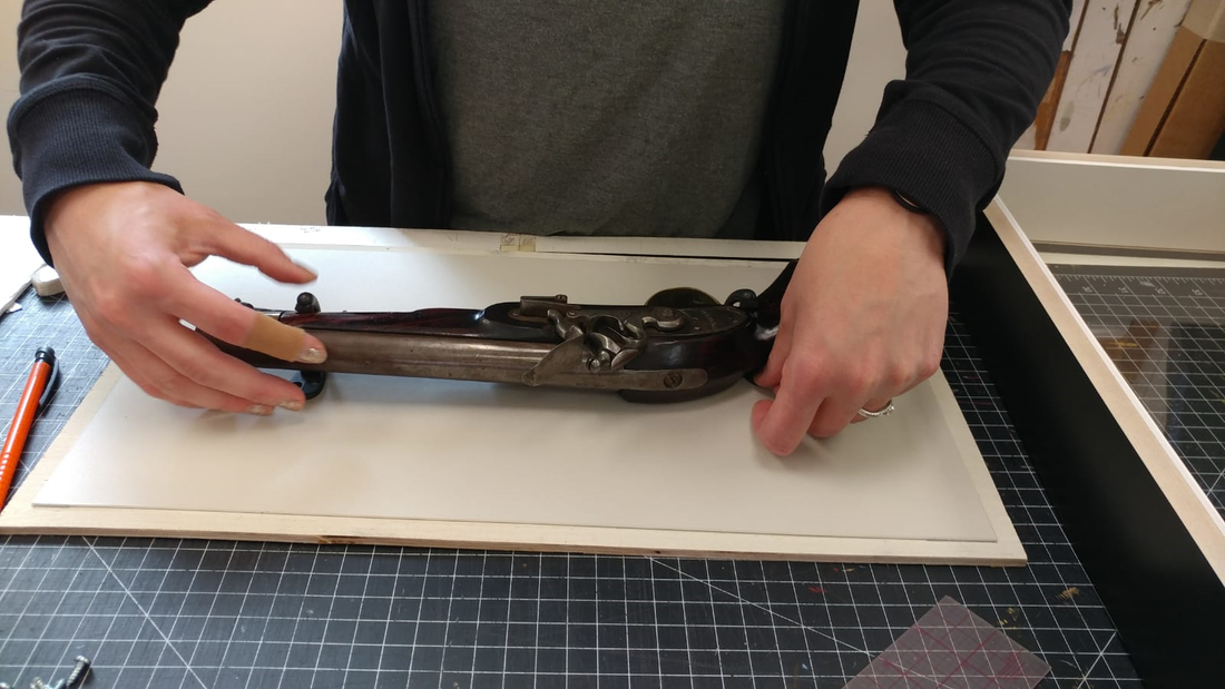
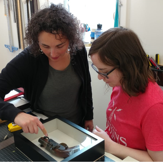
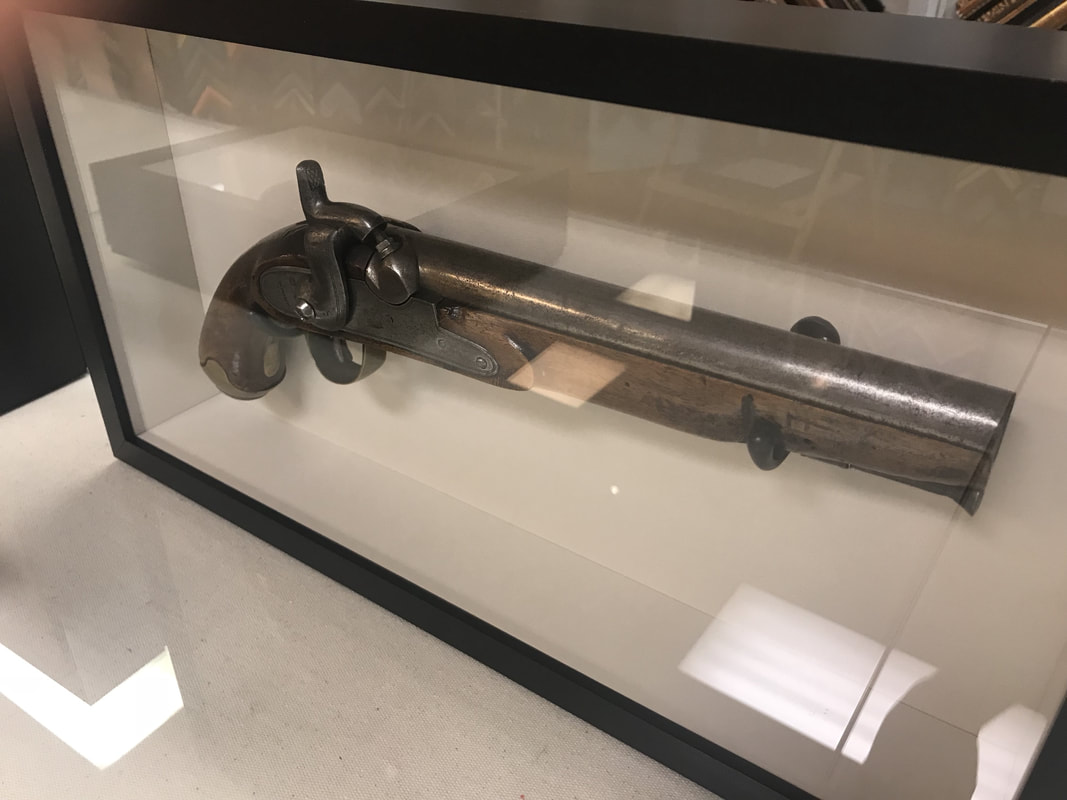
One of our favorite things to frame are old family collections. This spring, we had a client bring in three antique black powder pistols. This kind of artifact is so often stashed away and out of sight. What fun to bring them out into the open for all to see! After very careful and thoughtful time on the design counter, we went to work sourcing and designing supports and backing for these incredible pieces of history. We ended up choosing an antique bronze fixture for mounting the pistols. This finish compliments the old, distressed metal and wood of the firearms without being distracting. The bronze fixtures were lined with dark felt to provide a near invisible cushion and a gentle support against the weight of the heavy guns. This helps protect against damaging these irreplaceable antiques. Careful hands and placement are a must! Sometimes going to work is like a history lesson. We learned about how flintlocks work and imagined the hands that held these pistols over so many years. Once seated and sealed in their new frames, the pistols were ready to go home and be admired on the wall!
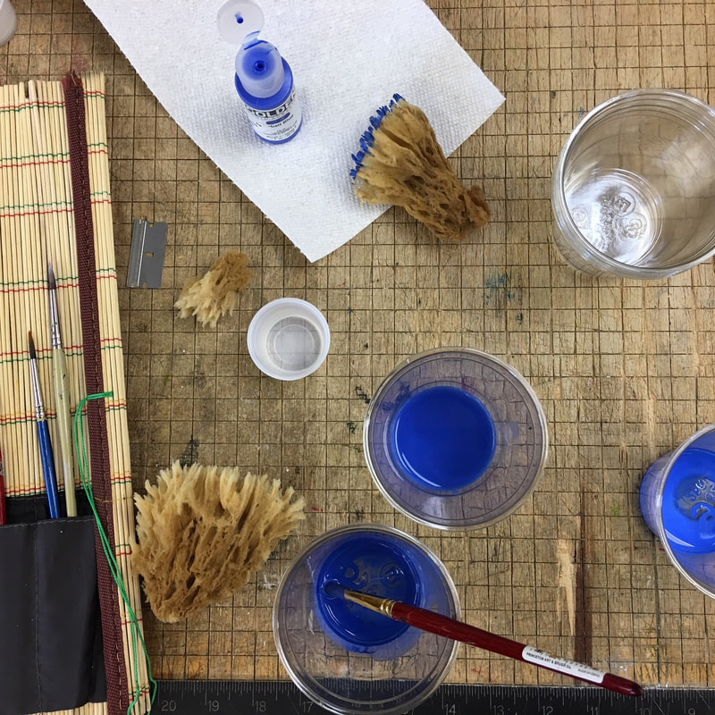
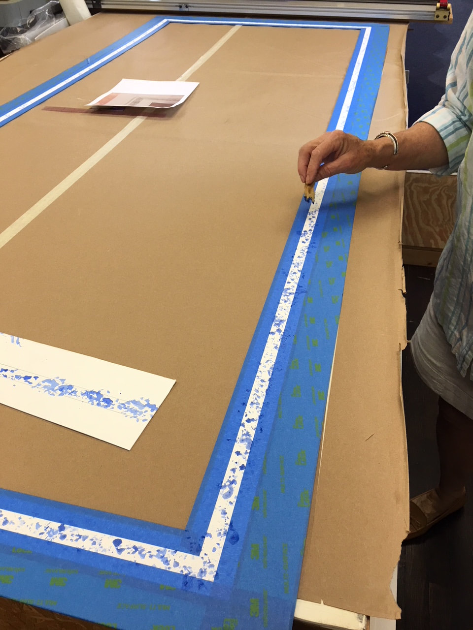
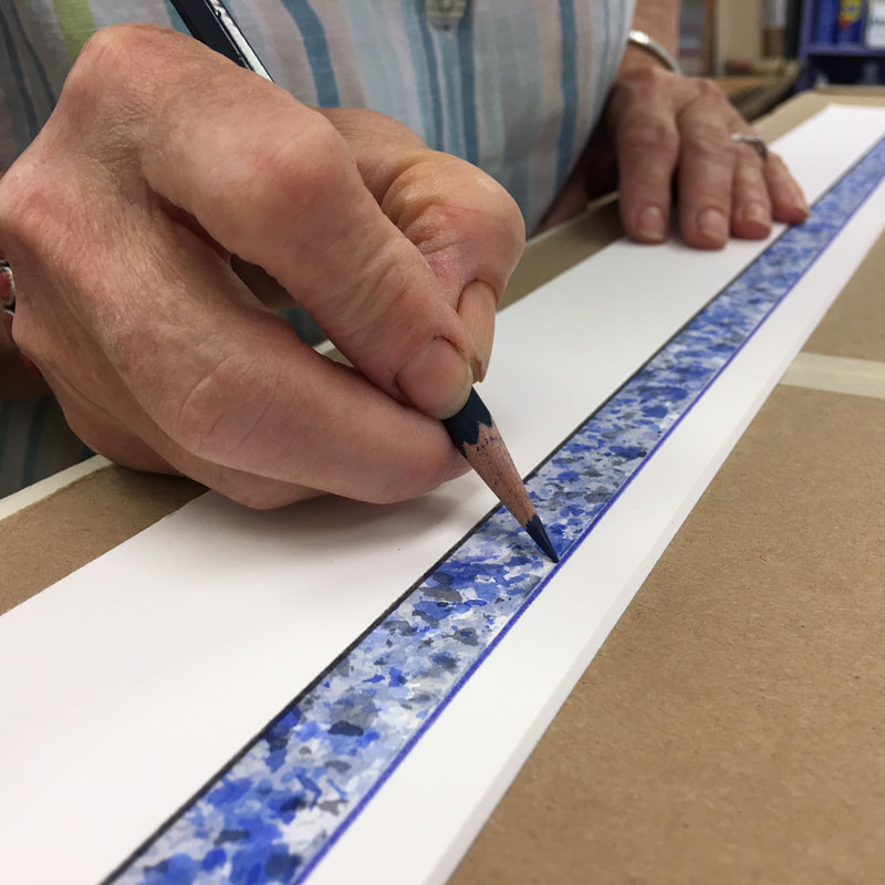
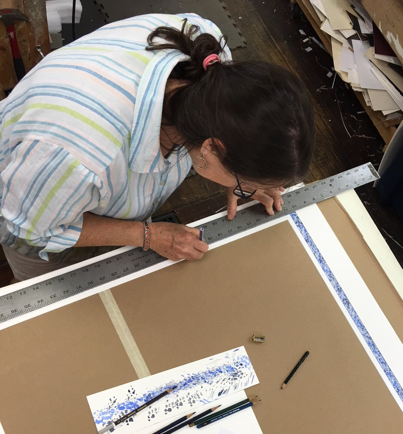
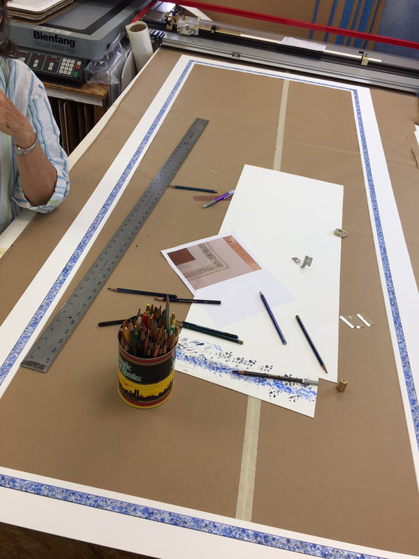
Following the minimalism of the past decade, we are seeing a revival of gold mouldings and painted mats. We absolutely love gold frames and a good painting challenge! On one recent project, our client had a very large tapestry that needed the added presence of a mat - something to separate the beautiful dark threads of the artwork from it's frame. A simple white mat wouldn't do on this oversized masterpiece - a whopping 3 by 8 feet! After carefully hand-cutting the mat, we used a nontraditional method of taping off a secluded 3/4" panel of the matboard. Within this exposed area, Anne went to work on a loose and playful sponged pattern, using colors inspired by the artwork. As a contemporary alternative to the usual penned lines found on many traditional French Mats, we softened the finished edges of our sponged panel with lightfast colored pencils in complimenting colors. Projects like these stretch our vocabulary and show us what we're made of. We can't wait to get this mat placed on the artwork, perhaps into a gold frame, and then into the hands of our adventurous client!
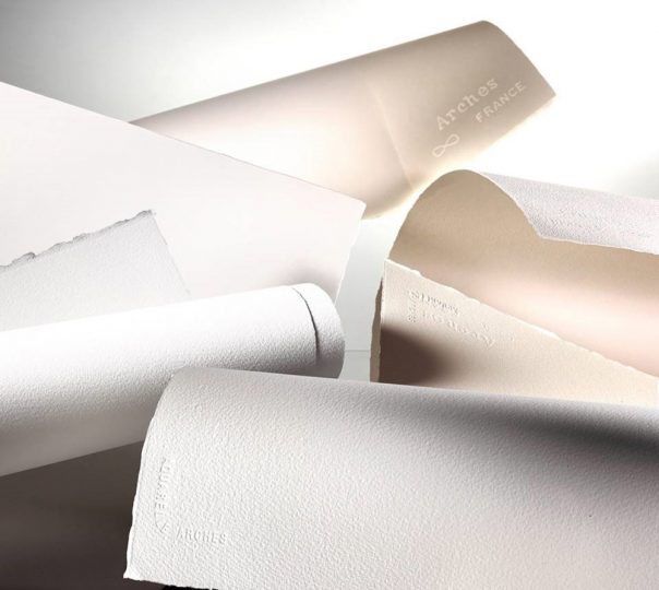
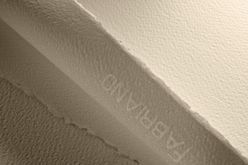
Watercolors by definition are paints made from pigment suspended in a water based solution. The earliest known examples of watercolor painting are around 40,000 years old during paleolithic times. Ogg was inspired to react to his . . . her?. . .(let’s not make assumptions about artsy cave peoples) surroundings and decorate the den and we’ve fascinated with the process ever since. Poor Ogg did not have vibrant quinacridones or cadmiums with which to paint, OR some nice rag cotton watercolor paper either! Take time to consider that a good quality watercolor paper is just as crucial to getting good results in watercoloring painting as the paint that goes on it. Nothing is worse than wasting your good paints on an inferior substrate. We have a broad selection of watercolor papers but it can be overwhelming to choose sometimes so we’ll have a look at what you should consider when purchasing for your next painting adventure! Several factors like weight, content, sizing, and surface all come into play when making a decision. Here are a few rules of thumb: Content: Most artists prefer the texture and feel of 100% cotton papers. It is usually the mark of a high quality paper as sometimes papers can be made with other filler materials and not as desirable. It’s important to note the term “usually” because there are always exceptions to the rules and we happen to have some! Weight: Three of the most common weights for watercolor papers are 90lb, 140lb, and 300lb. These weights ultimately concern the thickness of the paper you on which you will be painting. As the paper fibers absorb water, they will swell and move and this result can result in buckling when areas of the paper absorb water differently than others. This is a more common problem in lighter papers like 90lb and 140lb. Artists will “stretch” or tack down their papers while working to avoid this problem. Other solutions are utilizing 300lb watercolor paper or using a watercolor “block.” The 300lb watercolor paper is so thick that it approaches the feeling of a stiff board and will resist buckling. A watercolor “block” is a stack of watercolor papers laminated together to hold all the edges of the paper down as if it had been stretched. Once a painting is completed, a razor or pallet knife is inserted into the edge and under one sheet of paper and then the painting is peeled off the block to reveal a fresh sheet beneath. Sizing: To combat the issue of bleeding, a sizing is either applied after the paper is made or impregnated into the paper making process. By coating the fibers of the paper, it helps to add strength to the paper as well as resist the pigment particles from soaking into the paper itself. This does one of two things: 1.) Having the paint rest closer to the surface of the paper will make colors appear more vibrant and 2.) the paint will be easier to lift and move if it needs to be reworked. Surface: Watercolor paper comes in a variety of “toothes” or textures. Three of the most common are Cold Press, Hot Press, and Rough. It can sometimes be hard to remember the difference between the first two but considering the temperature might help. Cold Press refers to the process during the end of the paper making in which the papers are rolled through room temperature metal rollers to squeeze out excess water. The result is a watercolor paper that has a slight surface texture that feels very natural. Now, if those rollers were heated, they would act as a hot iron would when you are ironing a shirt. As they squeeze out excess water, they are ironing the fibers flat and the result is a much smoother surface texture. Rough textured watercolor paper is made for those who want a more exaggerated version of the Cold Press texture. There are many rough bumps and peaks of paper fiber throughout. On the subject of preference, illustrators and those wishing to do fine linework may choose to use Hot Press; Cold Press is a good choice for any watercolor painting and is a great way to introduce the process to a beginner, and Rough can be a preference for those who enjoy the texture and have had experience with the watercolor process. Here’s a quick chart that can help you at a glance decide what paper choice might be good for you: watercolor_paper_at_the_art_box_-_sheet1.pdf As I mentioned earlier, there are exceptions to the rules and here are a few that we keep in stock. Yupo paper is actually made from extruded polypropylene. Fascinatingly, it is made right here in Virginia at their Chesapeake facility. Because it is a plastic the colors do not soak in but have time to rest, pool, and granulate. Yupo encourages many different textures. It is smooth but not slick and has been popular with many of our local artists. Aquabee Super Deluxe Mixed Media pads tout themselves as the “only sketch book you’ll ever need” and they are not far from the truth. They are excellent for field journal work and they have a secret duality. The front surface of the paper has a tooth for those who like a Cold Press finish and the back surface has a smooth surface to cater to those Hot Press fans. Stonehenge is the newest edition to the lines of watercolor papers that we carry. We love it’s bright white and even Hot Press texture similar to the regular Stonehenge. It’s 100% cotton, acid free, ph neutral, and utilizes no animal gelatin. Hopefully this was a helpful primer on navigating the world of watercolor papers. Come on down to one of our locations touch and feel our papers first hand and geek out with our staff! We always enjoy hearing about your process and may have some new products that will inspire or troubleshoot an in-studio snafoo you may have run across. Happy Painting!
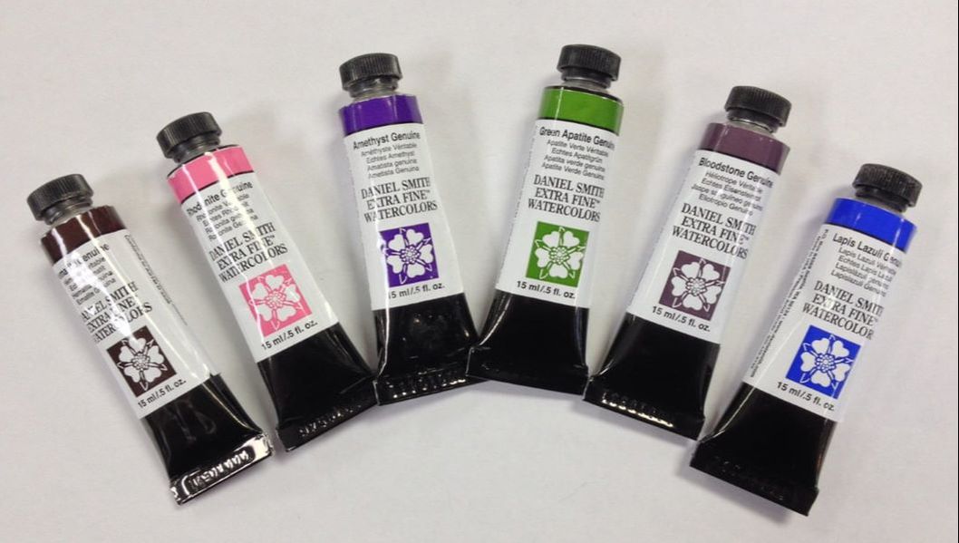
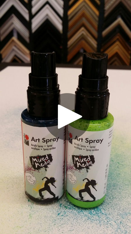
So what is PrimaTek? Glad you asked! Daniel Smith started his company in 1976 to make professional artist grade printmaking inks. In 1993, he started producing watercolor paints. All of his paints are manufactured in Seattle, Washington. The PrimaTek colors have been slowly added to the watercolor selection. 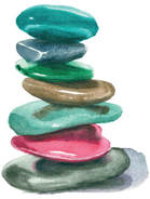 Image courtesy of Daniel Smith Co. Image courtesy of Daniel Smith Co. There are 38 PrimaTek watercolors available. The exciting aspect of these paints is that they are all created from natural minerals and semi-precious stones. The company sends their geologist around the world seeking out the finest natural materials. Rhodonite from Germany, Serpentine from Australia and Lapis Lazuli from Greenland and Mt. Vesuvius in Italy to name a few. 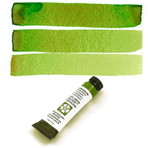 Each mineral is tested in house by their color chemist to see if it will meet the high company standards. The minerals are all milled to the optimum size for that specific material. If the size is too large the paint will be grainy and if the size is too small the color will be dull. Just like in the Goldilocks story everything must be just right! Many of these colors granulate as you paint with them. That means that some of the pigment will settle into the valleys of your paper giving great texture effects. Watch the video below to see how PrimaTek mix to make wonderfully complex colors. We love the new Art Spray from Marabu! It's great for mixed media fun!
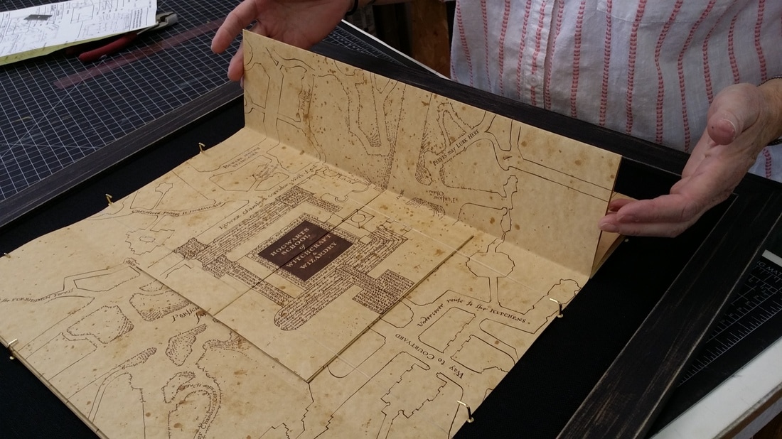
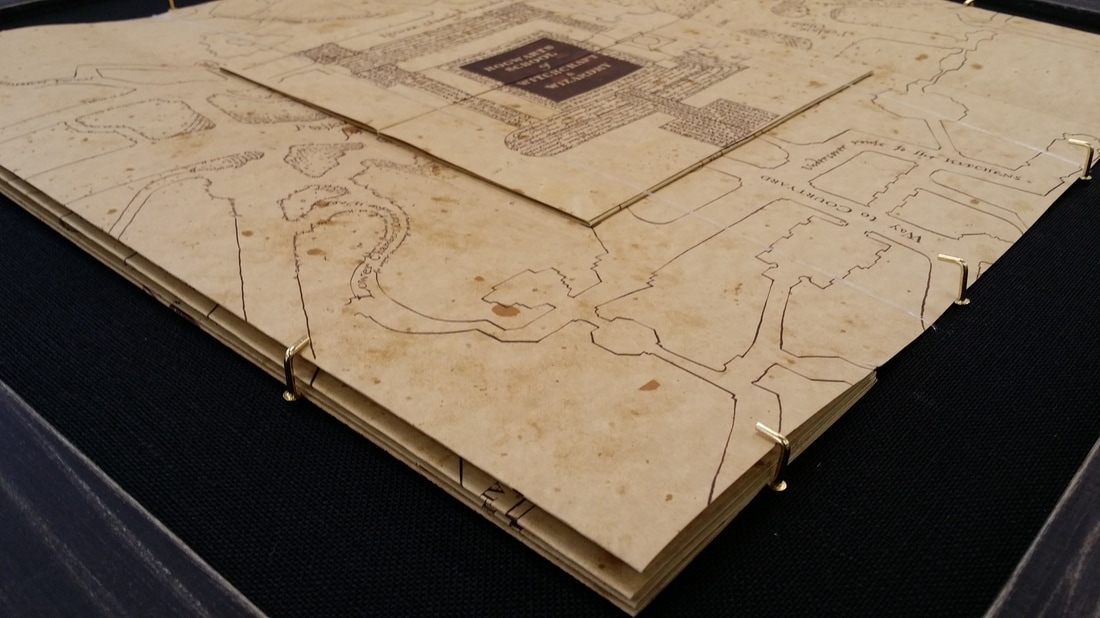
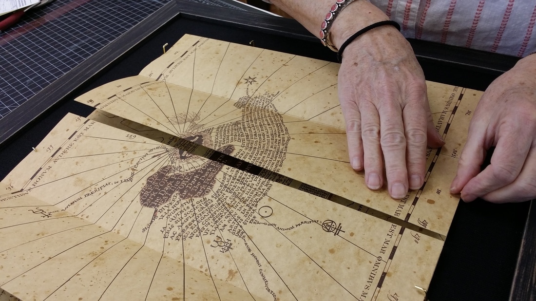
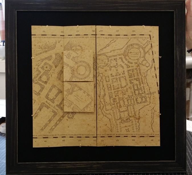
Click on the picture below to see it in action! One of our favorite projects to date! A client in our Crozet shop brought in a magical Marauder's Map! 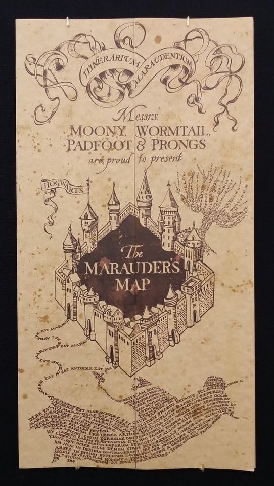 For those unfamiliar with the Marauder's Map, you must see the Harry Potter series for a full reveal. From www.harrypotter.wikia.com: "The Marauder's Map is a magical document that reveals all of Hogwarts School of Witchcraft and Wizardry. Not only does it show every classroom, every hallway, and every corner of the castle, but it also shows every inch of the grounds, as well as all the secret passages that are hidden within its walls and the location of every person in the grounds, portrayed by a dot. It is also capable of accurately identifying each person, and is not fooled by animagi, Polyjuice Potions, or invisibility cloaks; even the Hogwarts ghosts are not exempt from this." This beautiful rendition of the Marauder's Map has layers and layers that unfold and expose different levels of the Hogwarts School. Our client wanted to be able to interact with her map, so a unique framing solution was needed. Here, you can see the many layers. In addition to the outer folds of the map, the very center reveals a smaller folding map that cascades perpendicular to the map's major folds. If you look very closely, you can see a clear thread that pulls across to keep the smaller map in place. This thread is stretchy and allows for the viewer to pull it away and unfold the inner map for viewing. Along the edges of the map, we installed brass turning hardware. This hardware can be turned away, allowing for the map to fold or unfold to a new layer, then turned back to hold the new map view in place. This map is an exquisite piece of architecture. Bookmakers, illustrators, and paper enthusiasts will all agree. We show off its worn, yet magical air, with a dark linen mat and an understated wooden frame. Don't you love it?! We do!
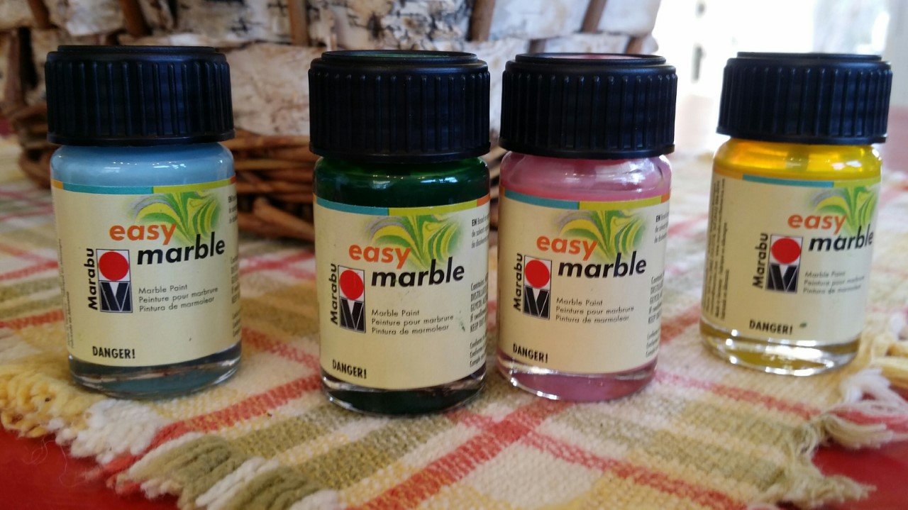
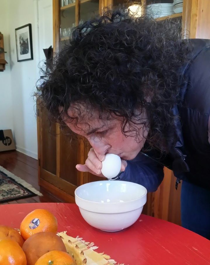
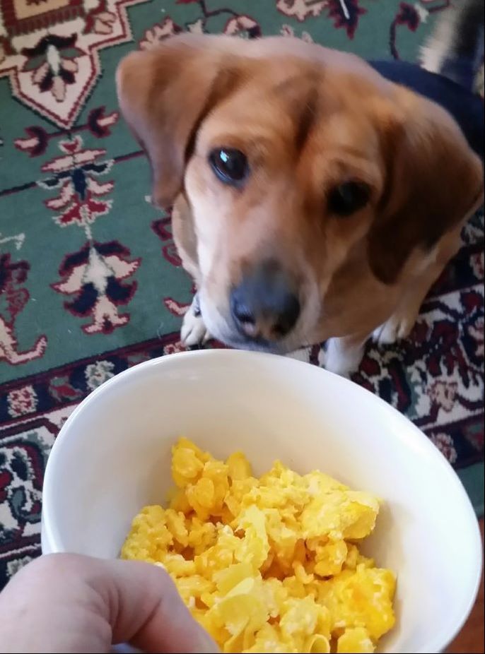
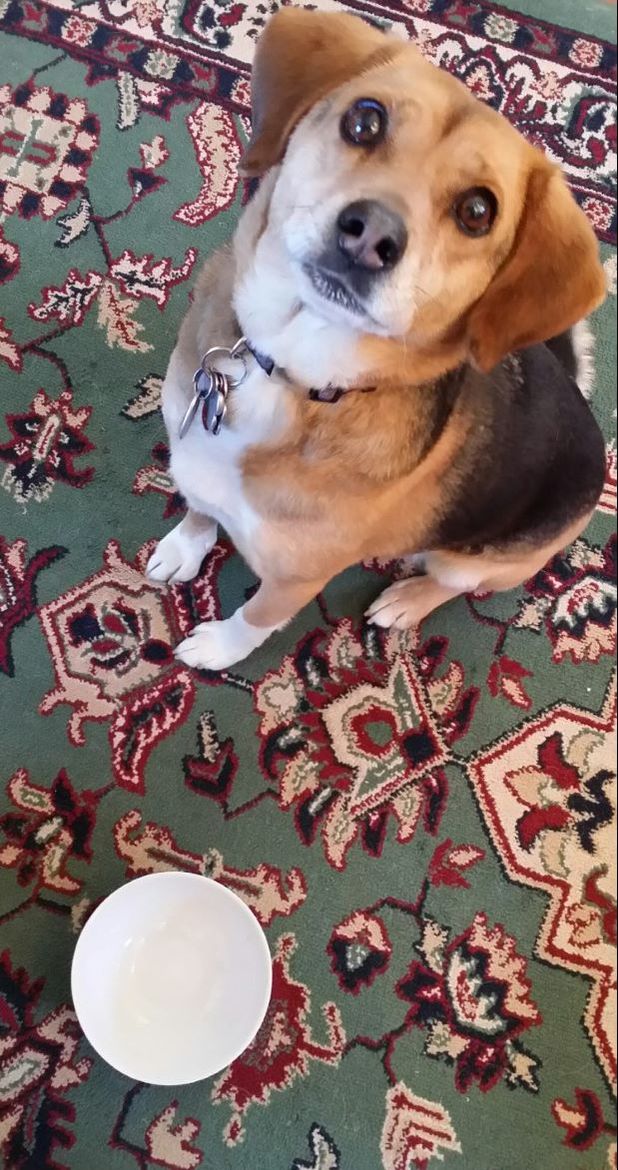
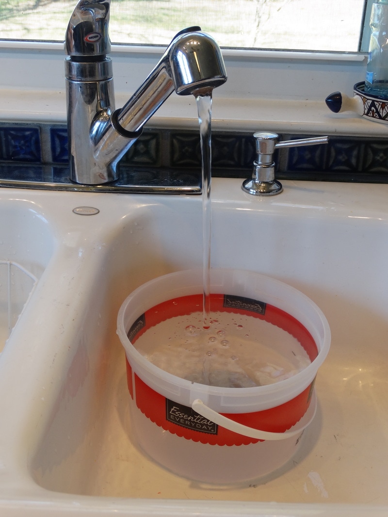
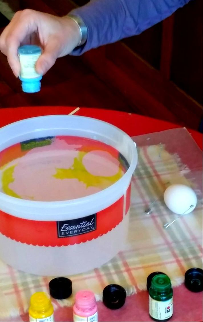
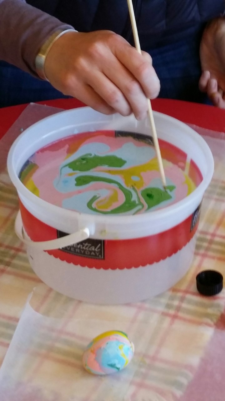
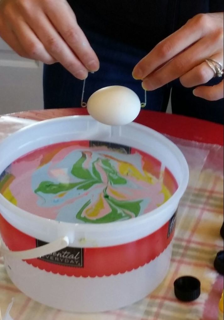
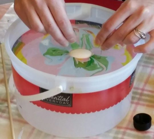
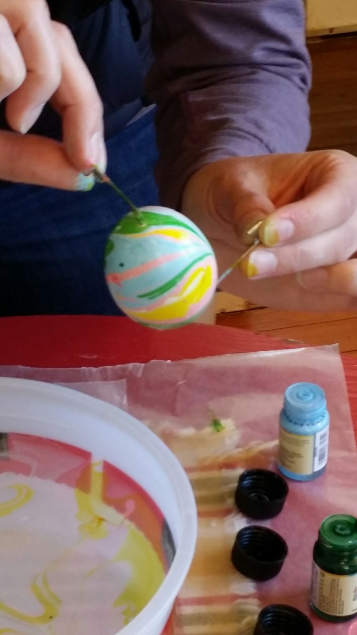
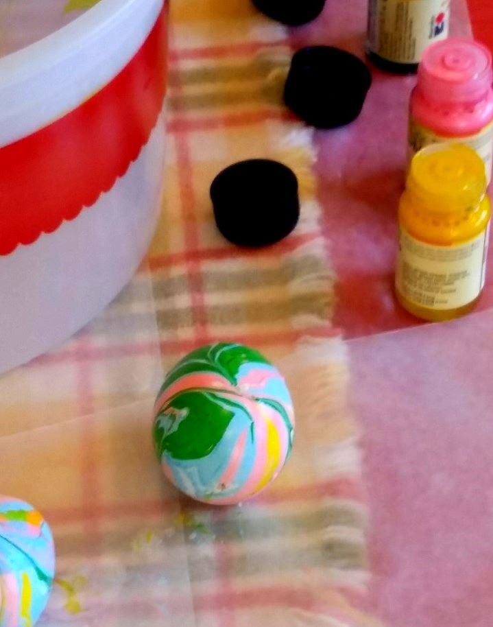
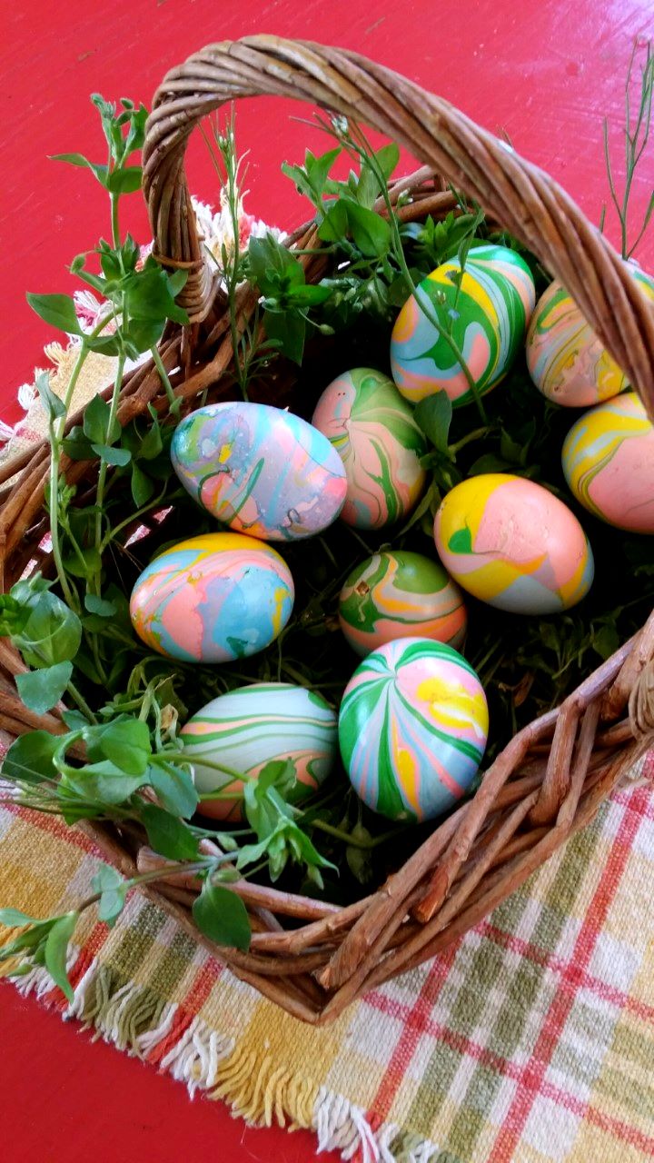
Hi Folks! Here is a demo of one of our most interesting products. It is made by Marabu, and is a resin based marbling compound that is easy to use and will stick to almost anything. Here's what you need to gather to do this project: Some eggs Two large safety Pins A disposable bowl or bucket to hold water 3 or 4 Colors of Marabu Easy Marble Paper towels Wax Paper to cover your table We decided to make marbled easter eggs, so we started by blowing a bunch of fresh eggs from Anne's free range chickens. "Princess Penny of the Pillows" got to eat the yummy contents... She probably would have liked it if we had blown even more eggs... Next, fill a "non-precious" container with water. Drip the colors onto the surface of the water. Swirl the color on the surface of the water with a skewer or stick. With your egg suspended from two safety pins, lower it into the marbling mixture. The marbling compound will wrap around the egg as you lower it below the surface of the water. Once you have lowered the egg into the water, you should blow on the surface of the water to move the extra marbling paint away from the egg before you lift it out. A finished egg. They dry to the touch in about 10 minutes. Our beautiful basket of Easter Eggs. And soooo EASY. Check out our YouTube video! Watch Amanda in action.
|
Creative Framing & The Art BoxJoin us on our Creative Journey, encouraging people to embrace the Arts as we share our experience! Archives
November 2021
Categories |

 RSS Feed